By Mark Richards, SAFe Fellow, Original Post, Shaping Agility
SAFe Fellow Mark Richards is a wise Agile wizard. He has many years of experience as a developer, an architect, and as a coach. Mark amplifies human connection and positive behavior in all he does. In this SAFe Fellow blog, Mark shares how to create features that not only capture attention but spur action. He gifts us with a feature template he has refined over the years with customers. From feature naming and problem statements to hypotheses and prioritization, this canvas brings together impactful feature design. Embrace this chance to propel your product teams toward unprecedented success with a method that bridges creativity, clarity, and strategic alignment.
Happy reading!
—Rebecca Davis and the Framework Team

One of my favorite exercises in our Product Owner Program involves asking the students to review a sample feature canvas and compare it to the features they currently prepare for PI Planning. I measure the effectiveness of an exercise by the commitment to action that follows the debrief, and this one rarely fails.
The power of a good canvas lies in prompting you to examine a series of questions and then distill the answers you discover. The result should avoid distracting details and synthesize critical information to anchor rich discussions.
In my early years coaching SAFe implementations, I helped the product group of nearly every ART I worked with to create a Feature template. The Framework guidance suggesting a name, context, benefit hypothesis, and acceptance criteria was a great starting point, but they generally needed something more specific.
Working with creative product people allows you to learn from their ideas. When I saw something work well, I incorporated it into my starting point with the next group I helped.
There were three big traps I was trying to help people avoid:
- The overhead of developing and maintaining different versions of the Feature to use with different audiences
- The misalignment caused by disconnects between the work of Service and UX designers, Architects, and Product Managers
- Cramming in so much detail that the Feature effectively turned into a traditional waterfall artifact
By 2018, my starter template had stabilized so that many product groups just ran with it “as-is.” I published a copy that became one of the most viewed posts on my original blog. Since then, I have slightly simplified the original canvas and talked more about the ‘optional extra’ information.
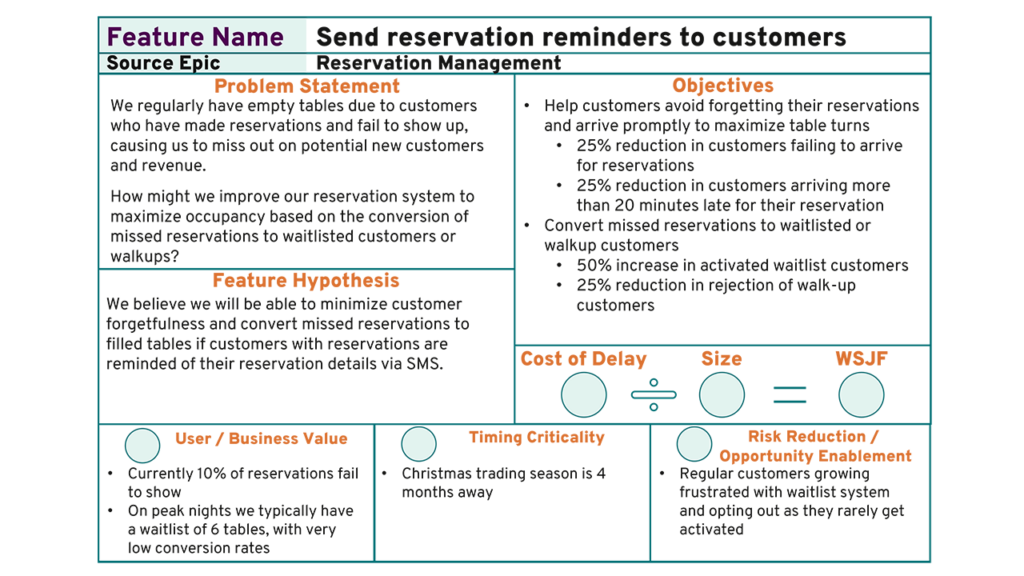
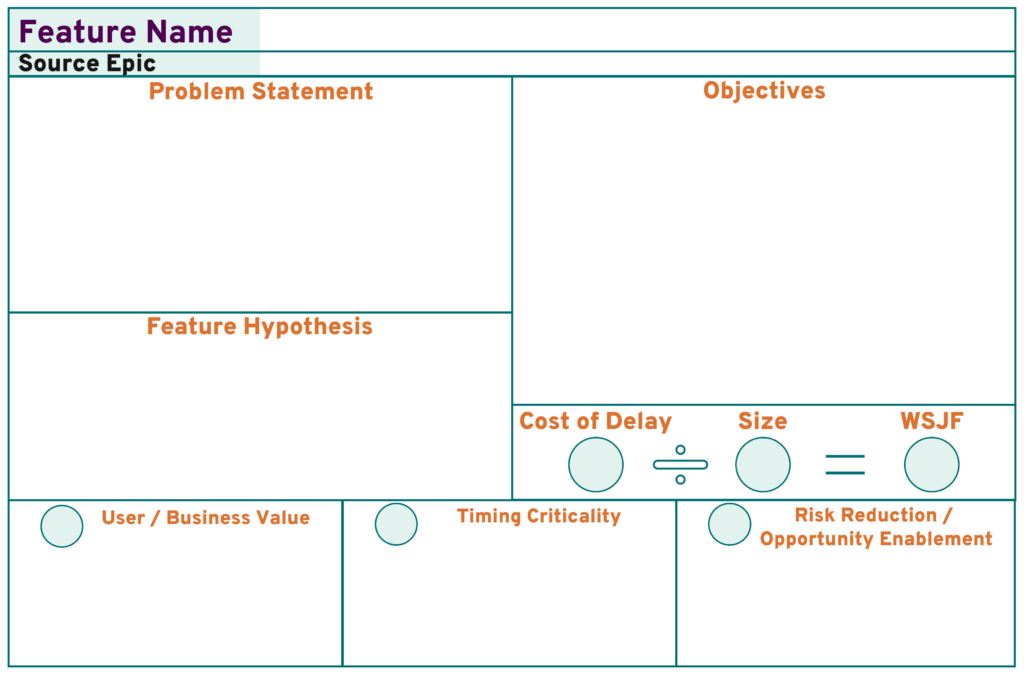
Feature Canvas

What’s the best way to name a Feature?
People remember the name of the Feature more often than the detail. Frame your feature names to describe the customer outcome and imply intent boundaries.

How do you write a compelling Problem Statement?
The most common problem statement pattern I observe is “How might we …?” This is concise but fails to articulate the nature and impact of the problem. I love the two problem statement templates published by Jeff Gothelf in Lean UX:
New Product
The current state of the [domain] has focused primarily on [customer segments, pain points, etc].
What existing products/services fail to address is [this gap]
Our product/service will address this gap by [vision/strategy]
Our initial focus will be [this segment]
Existing Product
Our [service/product] is intended to achieve [these goals].
We have observed that the [product/service] isn’t meeting [these goals] which is causing [this adverse effect] to our business.
How might we improve [service/product] so that our customers are more successful based on [these measurable criteria]?
What is your hypothesis?
Jeff Gothelf’s hypothesis template does a great job of prompting thought about both the “business outcome” and the “user outcome.”
We believe this [business outcome] will be achieved if [these users] successfully achieve [this user outcome] with [this feature]
How will we validate whether the Feature fulfills the hypothesis?
If you want to maximize the impact of your Feature, you need to be able to measure it. Whatever form you use to express your objectives, make sure they’re measurable and that the solution you implement is capable of yielding the supporting data. They should support the hypothesis’s validation (or invalidation) and quantify the expected movement. Many product teams get great value from expressing them in OKR format.
What data supports Prioritization?
Prioritization with WSJF and Cost-of-Delay (COD) works exceptionally well with supporting data but can devolve to ‘who expresses their opinion best’ in its absence. Deliberate attention to gathering and presenting summary data about each COD element supports a far more objective prioritization session. It enhances understanding of the ‘size of the prize’ expressed in the problem statement.
Extended Information
While every Feature benefits from clearly articulating the elements represented by the core canvas, the type of extended information necessary to define a Feature in a fit state for PI Planning is much more contextual. I consider the Canvas to be ‘part of the template,’ maintained in a fashion that makes it easy to use for printouts and slides. Extended information is often too lengthy for a canvas to be a helpful presentation format. Experiment to find the best way to represent it, even if this is capturing links to other artifacts.
The most common extended information includes:
- Architectural considerations and draft high-level solution designs
- User Research Information and low-fidelity visual designs
- Feature-specific non-functional requirements
- External dependencies
- Key subject matter experts
Acceptance Criteria are non-negotiable. I coach product teams to express them as BDD, but that’s an entirely different post!
Closing Thoughts
The best way to articulate your Features will evolve. Build ‘relentless improvement’ habits into your lifecycle. A great option is to put three ‘feature definition retrospectives’ on cadence:
- Following your prioritization workshops
- Following PI Planning
- At the end of the PI
Good priming questions include:
- What information did we wish we’d captured to support better conversations?
- What information did we capture that wasn’t needed or turned out to be wrong?
- What information did we capture too early or too late?
Early on, you’ll almost certainly find yourself adding detail. You should think of this as ‘training wheels.’ As your teams improve at emergent design and iterative and incremental development, the need for detail should shrink.
Would you like a copy of the template to get you started? You can download it here!